For some time now, anyone concerned with search engine optimization made sure a mobile version of their website was available because otherwise they ran the risk of angering the Google algorithm. Yet unlike so many other trends in the SEO world, research shows that mobile web use isn’t slowing down, even though many of the so-called mobile friendly websites are a pain to use. Not only are mobile views growing, they are blowing up.
Of course, not everyone wants a mobile website that is just good enough for Google. They want their visitors to have a positive experience when they land on their website, or one that they designed for a customer. So they adjust their designs accordingly.
Choose the approach which suits your design philosophy
Most people associate mobile web with responsive web design because that has been the buzzword thrown around different blogs and presentations for some time now. However responsive web design isn’t the only strategy, and it isn’t always the best approach. The best choice is based on how you want your visitors to interact with the content on your site.
- RESPONSIVE WEB DESIGN
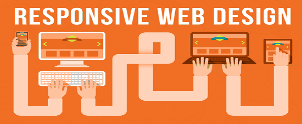
Using media queries to change the display of the site based on the screen size, this is a fluid approach to designing for multiple devices. You design once and rely on the CSS to scale the display based on the screen.
- ADAPTIVE DESIGN
This approach relies on static pages designed for different breakpoints. When the screen size is detected, the appropriate layout is displayed. Here, you need to design different layouts to accommodate various screen sizes. Usually, six layouts are built for the more common widths: 320, 480, 760, 960, 1200, 1600.
- NATIVE APPLICATION
This is when you develop an iOS, Android or Windows application designed to offer your web content and user experience to the mobile users.
It is not easy to find a website these days that doesn’t offer some sort of user interaction. It could be a business website that collects information from prospective customers, an E-commerce site built for online shopping, or a website which allows visitors to check-in to an event or location. In any event, the user is going to have to provide information, make selections and press buttons and you have to get into the mindset that things on a mobile device are different and the layout needs to be properly designed and planned accurately.
For starters, focus on important features. This might require some rearranging on your part, or you may have to cut back on some of the elements you wanted to include. Not only will this help reduce clutter, but it will allow for larger buttons and other elements that larger fingers may have a hard time engaging with. When at all possible, reduce the need for users to enter text. They may have an onscreen keyboard to use but we all know that there is a high rate of error when using these and features like autocorrect or text predict can become quite frustrating. Also, understand that there is a good chance that a mobile visitor may be interrupted or lose their connection. The less they have to re-do if they time out, the less frustration they are going to feel.

